Friday, 4 May 2012

Plans for my Main Task products

Front Cover Plan
                          
Double Page Spread Plan

Contents Page Plan

Tuesday, 24 April 2012

Media A-Level- Audience Feedback

Media Footage- A Level- Magazine industry research


I created this video on the Apple programme iMovie, which gives users the opportunity to make professional videos, trailers and films. I selected the four most similar magazine's in the industry to show the comparisons between them and Urban Magazine. In particular Q magazine gave great inspiration to my main cover image, as Oasis star used a similar pose on an issue of Q. The image of grime and street-life is a very important to my magazine, therefore I included urban music and freestyle dance footage in this montage. As all the magazines are in the same market  segment analysing the images, features and layouts are very important. Signifying the target audience is essential for a magazine as it is how to sell the product in the market effectively, which is why the need to show the urban-style in all aspects of the magazine and also in my media blog.

Wednesday, 18 April 2012

Boy London

Boy London is a designer label founded in 1977 by Stephane Raynor; it was the most iconic fashion brand of the 'underground scene' and has influenced the image of street-life ever since. Cross promotion is essentially in creating trends, particularly in fashion, therefore Boy London introduced a wide range of sources to show their clothing range- websites and partnerships with Selfridges who sell their products. Like most iconic labels Boy London had a 're-birth', as it began to focus on international markets, there was a downfall in sales in the UK, therefore in 2007 a new line titled 'Sick' was added to the new East London store, reigniting the previous hype of the urban label. Since 2007 the highest sales ever have been recorded in the UK, mainly due to the interest if this label by celebrities, such as Rihanna, Boy George, Cher Lloyd and Jessie J. Some of these artists are the main representation of R&B music across the globe; therefore creating the overall image of this genre. The magazine 'Preppy' featured Boy London hugely and anchored its image and success, this idea is very significant for my own magazine 'Urban'. The main image featured on the cover is one of great similarities to an ideal reader of my magazine. 'Preppy' has an extremely similar identity of reader as my magazine and the idea of partnering with a urban clothing label is one that Urban magazine would also greatly consider. Boy London is a very iconic brand, however the image of Urban Magazine would be a more modern and developed image (but essentially inspired and originated from Boy London and 'Preppy' magazine').

Friday, 23 March 2012

Imaginery Entity

Life-Style Questionnaire
1.      Are you male or female?
-Male

2.      How old are you?
-15 (15-18)

3.      What type(s) of music do you like?
-R&B, Grime, HipHop

4.      Do you live in a city in the UK?
-Yes (London, Manchester, and Newcastle etc.)

5.      What shops/ brands clothing do you wear?
-JD Sport, Topshop, Footlocker, Urban Outfitters, Adidas Originals

6.      Do you attend any out-of-school clubs?
-Yes

7.      Do you have a part-time job?
-Yes, I like making money for myself.

8.      How often do you go out with your mates?
-Most weekends

9.      Are you interested in current famous musicians & their lifestyle?
-Yes, I read gossips magazines about all my favourite celebrities.

10.   List your hobbies & interests:
-Music, Dance, Shopping, Going out.

11.  Do you smoke?
-No

12.  What films do you enjoy?
-Kidulthood, Adulthood, Get money or die trying, Football factory, Green Street.
These questions represent the imaginery entity which I am aiming my magazine at. The youth of cities around the UK, who enjoy R&B and Grime music, will be greatly attracted to the cover, contents and double page spread of Urban magazine.
Social Stratification: The A B C1 C2 D E social scale derives from the Registrar General’s Scale of Social Class.
The entity of Urban Magazine would situated between RWD and Q magazine- £2.00, this would mean the stratification would be around the C area.

Semiotic Research

Linguistic: Comprising aspects such as vocabulary, generic structure and the grammer of oral and written language. This is relevant as it reflects the mode address magazine's use when communicating with their audience. For example Urban Magazine uses modern, young generation language to engage the suitable audience- ''Rumours are flying around that you've been in some serious talks with the US record label Young Money.''

Visual: Comprising aspects such as colour, vectors and viewpoint in still and moving images. This is addressing the colour and images used to entice a potential customer. A front cover which draws in a audience has done it's job effectively as all magazine's when on a shelf need to essentially sell themselves, particularly when new into the market. The colour contrast on black, orange and white for Urban magazine are effective, shown in the results of feedback.

Audio: Comprising aspects such as volume, pitch and rhythm if music and sound effects. This is not directly relevant in the production of magazines, however the awareness of music is significant for synergy and cross media ownership, as magazine's feature music and play a huge role in promoting it.

Gestural: Comprising aspects such as movement, speed and stillness in facial expressions and body language. For example in main images featured in a magazine, have particular facial expressions and body language to reflect the style and target audience for the magazine.

Spatial: Comprising aspects such as proximity, direction, position of layout and organisation of objects in space.

Semiotics- The study of signs
A sign is anything that conveys meaning.
A sign has two parts-Signifier: The sign itself. (Images, symbols...)
                                       Signified: The meaning taken from the sign.

Denotation: The obvious meaning of a sign.
Connotation: The deeper/ hidden meaning of a sign.

Intertextuality: The relationship between texts, magazines can link to music and book reviews.

Polysemic: All signs have many/ more than one meaning. Meanings of signs can be influenced by age, gender and ethnicity.

Didactic: Denotative meanings that are less open to interpretation.
Syntagmatic: Meanings of signs that work together, for example a caption under a photograph, signifying a meaning together. 

Anchorage: Anchor the meaning of a text by using a supporting sign. 

Types of sign

Iconic: The signifier is connected to the signified through the principle of resemblance. These are important for images, as they symbolise what they resemble.

Indexical: The signifier makes the audience think of the signified because the two are used to connect to the real world.

Symbolic: The signifier is linked to the signified only by the human definition of words and meanings. In different countries, different words represent other things, for example the word 'Dog' has many other ways of saying it, with the same meaning, and doesn't change the overall concept of a dog.

Similar genre of magazine's- Front Cover, DPS & Contents page

These modern magazines are both examples of a similar genre of which my Urban Magazine will refelct. Both have a very similar target audience, however slight differences with price- Q costs around £2.00 per issue, whereas RWD is a free magazine, distributed to youth based stores such as JD sports. I hope to base these magazine's around the ideas for Urban Magazine.


 These examples of double page spreads show a relevent similarity to the spread that I planned and designed. The font both reflect a R&B styled tone shown by the text and the mode of address. The main image is the focus of the article, however this is a difference between magazine's as I wish to move from making the images the focus to the design and text as the image on the front cover is the main focus for the audience. The top Dizzee Rascal article has very bright and viberant colours with a bold image, making the combonation very effective.


Q, Vibe, RWD and NME are the most similar of style to my Urban Magazine, therefore the example issues taken from each of these, are extremley useful for research for my magazine. These examples of contents page are full of relevant images and text, which include plugs and pulls in order to sell their magazine. There are many competitions available, exclusive information and interviews. These are simple techniques that are very effective.

Friday, 9 December 2011

‘Urban’ Magazine
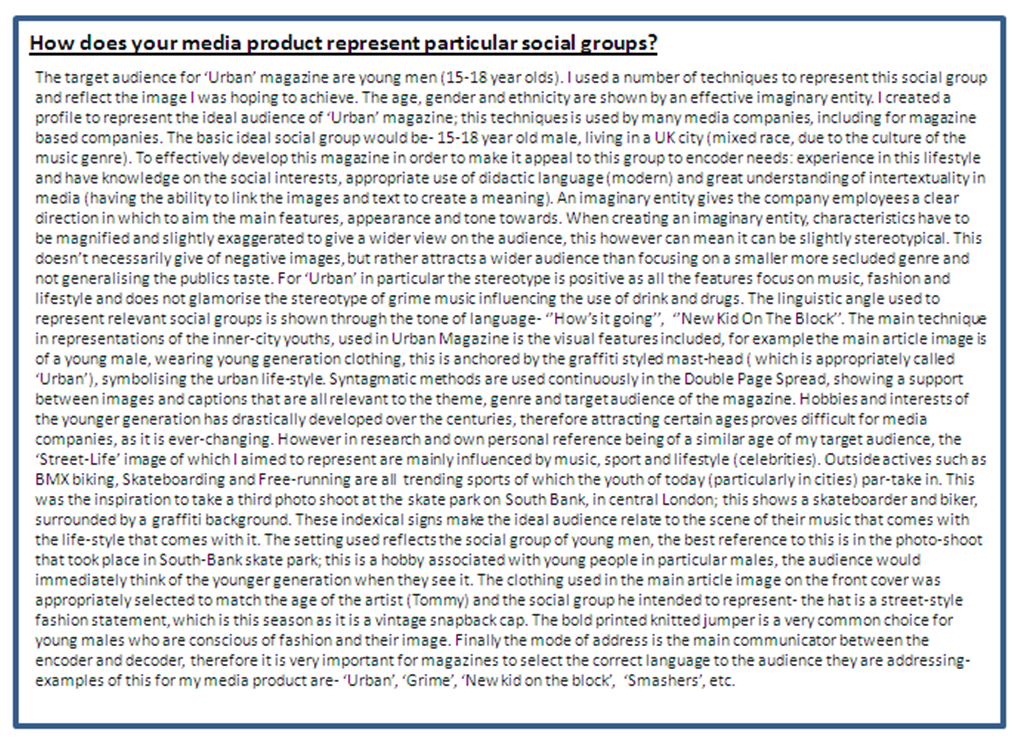
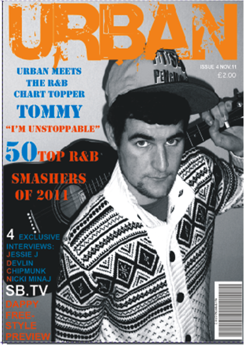
In the process of creating my magazine, I began the idea of using a different model in a different location. I wanted a female model that was situated behind a brick wall. After creating this cover (including the previous pictures) - the feedback from various sources suggested it wasn’t the right angle to take on the cover. Therefore I completely changed the whole appearance, and started again. My imaginary entity suggests more males will read this magazine than females, so I decided to use a male model on the cover. I began by outlining what kind of style and look I want to reflect by the images- it resulted in me taking a few shots with a variety. After they had been taken, I changed the saturation, lighting and turned the image black and white on the software program ‘Picnik’. The image shows a young male, who is 21 in reality, who is holding a guitar on his shoulders. He perfectly reflects the style of ‘Urban’ of which my magazine is targeted at. The design of the cover was re-thought and the layout was completely different to my first few attempts. I used contrasting colours, of blue and orange, for the text, with a bold ‘Urban’ in orange. It’s eye-catching as the font is original and suited to the street-grime style. The decision to change everything about my original cover has made me create a bold, well-suited cover,that reflects its target perfectly. The new images are better suited and relate more to the style.

Media Diary

13th September 2011- School magazine mock up completed, aswell as finishing the labeling of devices on the Cosmopolitan magazine.
12th Spetember- School magazine cover mock-up completed.
22nd September- Modern school magazine cover annotaed.
23rd September- Photoshoot planning for my school magazine front cover.
29th September- Modern Music magazine cover annoted- to give myself ideas for when I create my own. Also my Preliminery Task school magazine cover was completed.
13th October-Lifestyle questions for my ideal target audience were posted on my blog.
3rd November- School Magazine contents page completed, diary entry (photoshoot) & potential music magazine cover pictures posted.
14th November- Reseach completed on 'Marie Claire'  magazine Industry.
24th November- New pictures taken for a new start to my music magazine cover.
28th November- Final magazine cover completed, also my magazine rate card completed and posted.
1st December- Semiotic analysis of a current double page spread (in the music magazine industry).
9th December- Pie charts posted- showing the results of a questionnaire.
15th December- I have begun to plan my double page spread.
17th December- I planned and photographed my potential images for my double page spread.
1st January- I started to put together my double page spread on CorelDraw.
9th January- I planned my contents page.
15th- Double page spread is nearly complete.
27th January- Urban contents page is complete.
3rd Febuary- Research for other magazine's.
11th Febuary- Changes made to contents page and re-posted.
24th Febuary- Research for other magazine's contents page.
2nd March- Sorted out media blog, putting the correct labels on each post.
18th March- Evaluation slides were started.
25th March- Question one, two, three and four for the evaluation were completed.
29th March- Evaluation question were all completed.
15th April- Evaluation slides were posted on my media blog.
16th April- Media feedback video completed.
17th April- Magazine video completed.
17th April- Research into Boy London posted.

The Pie Charts show my target audience research, and the answers they gave, which gave me guidance in my magazine decisions.


Thursday, 1 December 2011

Semiotic Analysis of a Double-Page Spread 'Vibe Magazine'

MastHead
The MastHead is postioned in the left hand-corner, which is the first page an audience would been directed to. The iconic Rihanna quote 'Whats My Name' is situated behind a yellow block background. Below this 'Rihanna' is presented in light blue in front of a white background- connoting the importance of her name in this double-page spread. The font-size is in proportion to the other text size and main article image.
Main Article Photo
In this issue of 'Vibe' Magaizne, the front cover links to this double page spread (Rihanna features as the main cover image). On the two pages, the image is spread between the two. It makes this image the main focus of the artcile, over the text and the other photos on the far-right. The boldness of her red hair, creates a effective contrast of colours- red and yellow. The shot itself is a close-up, which has been enlarged to fit across both pages and it emphasizes Rihanna's huge success and power.
Cover Lines
As Rihanna is one of the most iconic women R&B singers of this generation, her name backed up with one the most iconic men R&B singers- Drake makes the article of huge appeal for the audience. However Rihanna's name is in capitals unlike to Drakes, suggesting the article will be mainly about the female R&B sensation. The text is in an italic font, making it stand out more, its also larger than the article's text. The cover lines size and font, reflects the importance of Rihanna and her significance in the music industry and article.
Text
The text of the double-page spread article is presented in a tone that suggests a laid back conversation between the encoder and decoder (audience). It primarily is trying to get the audience to buy her album- 'We’ve listened to it 14 times in a row and still don’t hate it’.
Layout
The article layout is text situated around the main article photo of Rihanna. On the left corner page the text is the information for which the article was created. On the right side as a plug device, which 'reveals' some of Rihanna's different hair-styles over her years of fame. This is a feature which would mostly appeal to women, it also makes the article more interesting and focuses on a different angle other than Rihanna's success in music. The hair styles analysis is presented on a black box background, backed up by yellow sub-headings and white writing. This article feature could mean 'Vibe' has an advantage over other competitors who don't offer this information of her hair-stlyes. The styles are presented cronologically, as her younger- self is at the top, eventually going down in the years untill now in 2011. 

Monday, 14 November 2011

The Magazine Industry- 'Marie Claire'

Magazines are produced for many different purposes, for example: Profit, Charity, Information and BBC (no advertisements). In Media there is a Structual Triangle, which outlines the basics in how to create a successful magazine- Target Audience, Advertising and Price/ Circulation.

In my specific research on  a recent'Marie Claire' magazine, I concluded these results- In total Marie Claire has 609 pages, 199 of these are advertisments and 410 are part of the actual magazine. This means the percentage of Adverts therefore is 33%. For a company, the purchase of a one-page advertisement in Marie Claire would cost £17,807(per page). In this issue of Marie Claire the 199 pages of advertisements would result in their (Ad) revenue to be £3,543,593 (profit). Finally the total revenue for the company, that includes sale revenue, would total at £4,220,712.50. In my research I furthered the calculations to a estimate of how much Marie Claire would make in an annual year- £50,648,550.